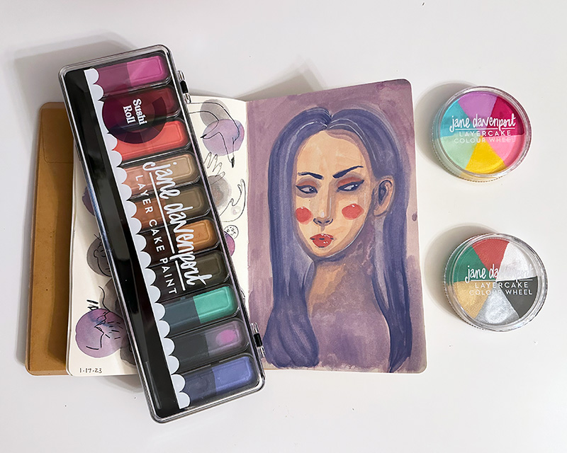
They’re here! They’re finally here!
Yes, like any self-respecting artist or crafter or hobbyist… I’m pretty obsessed with collecting supplies. Even when, admittedly, I end up not using a chosen supply very much, I still relish collecting them. Maybe collecting supplies is, in itself, a hobby…?
I’ve had my eye on Jane Davenport’s LayerCake (sometimes written Layer Cake or Layercake) paints for a long time, but I’ve had trouble justifying the expense to myself. Though there are a few YouTube videos of artists using these LayerCake paints, here aren’t a lot of in depth reviews of what the LayerCake paints ARE, how they handle, how the colors really look, what’s in them, how they compare to other similar paints, etc.
About the Brand
In case you don’t know, Jane Davenport is a mixed media artist known for her particular style of painting pretty faces and ladies.
Though I’m not deep into the world of mixed media, I was drawn to her work and supplies because I also love drawing and painting pretty faces and her use of bright bold colors is very appealing.
She has had product lines of water colors, stamps, inks, pens, markers, pencils, and more available at large retailers like Michaels in the past, where I was able to pick up her tins of watercolors (which I love using). However right now she only sells her products on her own storefront JaneDavenport.Com which ships out of Australia.
What are LayerCake Paints?

LayerCake Paints are described like this on the store page:
LayerCake paint combines the vivid opacity of gouache with watercolour’s ease of use, and acrylics’ layerability.
JaneDavenport.Com
When Layercake paint dries it has a divine, velvety surface. Think of it as a liquid Artist Pastel!
To me, that description is irresistible! I haven’t been able to get very into gouache because they’re mostly in tubes, which I feel too impatient for. But I wish watercolor were a little more opaque sometimes… so to me Layercakes sound like a great in-between medium.

I received some surprise Christmas money this year and decided to buy one of the large LayerCake pans in the color palette “Sushi Roll” and two of the new, smaller Colour Wheel palettes in “Golf Pants” and “Santa Baby.”
Sushi Roll is a selection of soft, muted colors. I was particularly drawn to the purples and blues in it. Golf Pants is a super bright pastel palette and Santa Baby is a more basic workhorse palette in (you guessed it) Christmas colors with black, white, red, green, as well as metallic silver and gold.
Shopping and Shipping
I’m going to include the shopping and shipping process in my thoughts here.
As I already mentioned, the store is based in Australia. Though the prices and your cart show your home currency, the final emailed confirmation and invoice comes in Australian currency. I was assured on the cart page I’d be charged whatever it told me in USD. This wouldn’t be a problem, except that once I hit submit, there was no longer any record of how much it had told me it was going to be in USD. Once I got the invoice in AUD, I started thinking about it and when I converted that amount to USD, it was more than I wrote down my total would be. Creating a fresh cart also gives a final total to the invoice. I don’t even know what I was actually charged yet, but I didn’t love the confusion either way.
I also had to pay Australian tax. We live in a state without sales tax and usually in my experience you pay tax based on where you live, so even purchasing from Australia, Europe, etc., I haven’t had to pay tax before, even when it shows up in the cart, it usually goes away when the payment system registers where I’m paying from. So that inflated the price beyond what I was budgeting in my head for.
The shipping situation was also disappointing because while JaneDavenport.com has a free shipping offer, the threshold is a very high $200. To top it off, many products are excluded from the offer, including all journals and papers I was looking at.
In short, the products are very expensive to start with, there’s an annoying currency exchange process, shipping is a lot, plus I had to pay a tax that I usually do not pay and did not mentally factor in beforehand.
In the end you have to balance whether its worth it for the items that are truly one of a kind – like these Layercake paints seem to be. It’s unfortunate that there are no retailers in the United States as that would cut down on a lot of the headaches. Maybe in the future!
Shipping was relatively fast from Australia, though the tracking never worked to give me any kind of estimate, it would only say “May take longer than usual” (super helpful!) I received my package 15 days after ordering it.
First Impressions
My first impression was that the palettes are larger than I expected. That’s always a good thing with art supplies! I was particularly expecting Sushi Roll to be the size of, say, a kids watercolor pan set, but it’s far larger and deeper. While this should mean that the paint will last much longer than expected, I do notice a 10 month period after opening (PAO) symbol, which I usually only see on cosmetics. What exactly this means for the longevity of the paint, I don’t know, but I’ll plan on following up if there’s any issues.
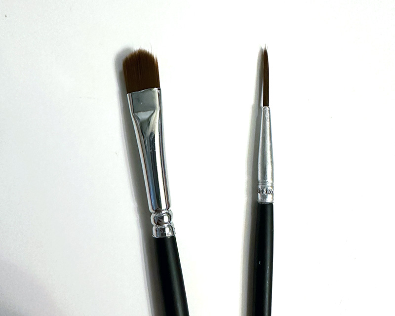
I also didn’t realize it would come with two brushes, but I’m not sure if I’ll use them. The liner seemed too frayed to be useful, but I did like the way the filbert shaped brush packed the color on.
Ingredients
The ingredients are listed on the back of Sushi Roll are as follows:
Calcium carbonate(35%), Aqua(30%), Glycerin(6%), Polysorbate 20(2%), Acacia Senegal Gum(1%), Phenoxyethanol(1%)Color Lakes25%(CI77891, CI42090, CI45380, CI 19140, CI77491, CI77492, CI 15850, CI15985) (sic)
The calcium carbonate is essentially chalk, which is what is giving the paint its opaque chalky look. It is used often in gouache as a filler and/or opacifier, but from what I’ve read, the more calcium carbonate that is used vs pure pigments, the lower the quality of the paint. And a lot of calcium carbonate can cause a whiteness to appear – I have already noticed some white separating out from the paints if there is water sitting on top of them, but a little swish mixes it back in.
The Acacia Senegal Gum is also known as gum arabic, which is the most common binder in watercolor paints.
The glycerin would help keep the pans creamy and hydrated instead of drying down to the hard, desiccated kind of pan a watercolor paint would have.
The colorants used are ones I’d have to specifically look up if I cared a lot about their lightfastness (that is, how much they will fade in sunlight), but since I’m not planning on using these paints to make something that will hang up directly on the wall, I’m not going to research that for now. My biggest use for these paints will be inside a sketchbook and pieces that I will scan and use digitally, so a particularly long-lasting color is not needed for me, personally.
After looking at the ingredients, I’m satisfied that they live up to their billing as being between watercolor and gouache.
Swatches
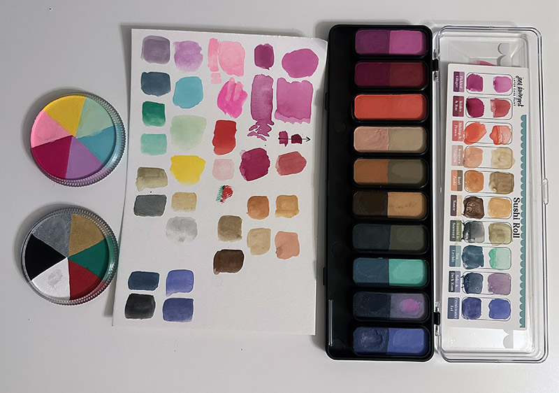
The first thing I did was start swatching at will, without much of a plan.
Jane Davenport’s paints usually come with a little swatch card to fill out, and I promptly made a bit of a mess with the one for Sushi Roll. Perhaps I should have gotten the hang of getting the consistency right before filling it out. Oh well!
I wanted to see how opaque and how transparent these paints could be. This page was me experimenting with the color “Sake” from Sushi Roll and “Caddy” from Golf Cart.
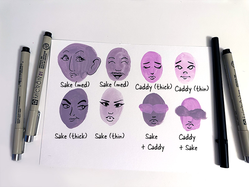
It seems for me the default application is a bit “medium’ in opacity, where one color could layer over another color, but not totally. It is also very easy to see brush strokes. With gouache a lot of people value the super opaque, smooth look. With these LayerCake colors, I can see that working the application a bit and troubleshooting amount of water vs paint can get that look or close to it at least for some colors. Adding more water also easily gives a transparent watercolor look.
So far it seems that the bottom layer is much more easily reactivated with water than even a normal watercolor is, so layering requires a very light hand or heavy application or else very purposely reactivating and mixing the colors underneath. Once I knew how much the bottom layers would activate I LOVED how easy the colors were to blend!
I was also surprised by how difficult it was to write over the dried LayerCake with a fiber tip pen (Sakura Micron). It really did not want to work. A brush tip, wetter pen worked far better.
For both layering colors you don’t want to mix as much and using pens over the LayerCake paint, it might be where using a matte workable fixative would be advised.
My guess is that the finished surface may be particularly fragile to marring, so for an experiment I am not going to seal this first painting in my sketchbook and I’ll just see how it fairs.

I did a little swatching of the pinks and reds as well as he greens just to compare some shades that looked a little similar in the pans. You can see for yourself which shades are close (or not).
Sushi Roll
As I expected, the colors look a bit different swatched than in the pan. Typically the colors a lighter and brighter than the pans might suggest.
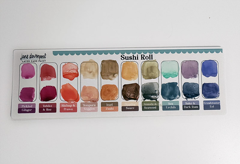
One pleasant surprise is the color “Dark Rum” which looks quite dark and mysterious in the pan and looks to be a dark grape on the swatch card graphic. In actuality it delivers a rich blue that bridges the cool greens of “Sea” and “Urchin” with the beautiful purples of “Sake” “Freshwater” and “Eel.” I’m very pleased with this end of the palette.
One unpleasant surprise is that to me the third pan in, ostensibly two different oranges (“Shrimp” and “Prawn”), look nearly identical on the paper. Maybe it’s a joke, since shrimps and prawns are very similar? And it’s not exactly my favorite color to start with. To me it feels like a wasted pan. On the plus side, if I did ever get more, these pans are able to be lifted out and switched around, so that’s something to consider.
The middle of the palette is a selection of six browns and peaches and sands that I can already see will be great for painting skin and portraits.
Overall, I’m very happy with Sushi Roll and glad I bought it.
Colour Wheel: Golf Pants
I was very excited to get this palette because the pastel colors seem to go together so well! I love Jane’s eye for putting colors together.
Swatching the palette yielded a few surprises though.

In this picture you can see the differences between pan, printed swatches from JaneDavenport.Com, and my own painted swatches on both white and black paper.
The biggest surprise is the color “Four!” which pan and graphic both would have me believe might be rich raspberry in tone. However it is more of a blinding hot magenta.
I was curious how “Buggy” was going to swatch because the graphic is far deeper than the pan looks to be. It swatched to me like a neon baby pink.
The mint green color called “The Green” is less opaque than I would have liked. I couldn’t manage to get a thick application. The color is, therefore, a little lighter than I would have expected.
Overall after this exercise I would say not to trust the printed graphic swatches from the store. One reason they’re different is likely that they are printed in limited CMYK space and many of Jane Davenport’s colors are far out neons and bright pastels that just don’t print without specialty processes and adjustment.
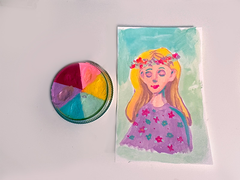
This is a quick, no-drawing painting I did on Mixed Media paper using just the colors in the Golf Pants palette. I really like how the colors go together and I’m very eager to experiment with this kind of exercise again, at least with this palette.
Overall, I really like the Colour Wheel Golf Pants palette and I’m glad I got it.
Colour Wheel: Santa Baby
Full disclosure: I was not super excited by this palette, but I thought it would be an efficient and cost effective way to add white and black to my selection of LayerCake paints. At the time of writing, a Colour Wheel palette was $16.08 while a single pan of white was $4.16, and the “bite size” mixing palette that has black and white as well as 8 other colors was $25.11. So there were a lot of permutations I could have chosen, and in the end I went with this one, thinking it was the best balance for me. And as far as I could tell, the other two palettes I was already committed to getting did not have pure red or green, and I thought the metallic paints might be fun.
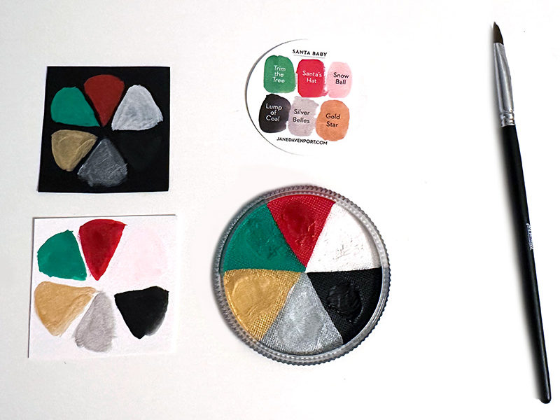
You can see the only surprise in swatching this straight forward palette is that the graphic swatch from the store shows “Snow Ball” as a baby pink rather than white. The explanation for this is obvious once I started swatching: The red color next to the white really wants to mix into that white. This is a big downside to getting this Colour Wheel palette instead of the single pan of white. To use the colors you really need to add a lot of water, but the water doesn’t magically stay where you want it, it flows around, between colors and even around the edge of the circle. This means there is a lot of opportunity for impurity in the color you’re trying to get.
The metallic silver and gold are huge misses for me. I’m not sure how many layers you’d have to build up to match the graphic swatch from the store, but two layers didn’t seem to add anything, so I haven’t experimented with more. They’re also not that metallic compared to Posca paint pens and Coliro metallic water color.
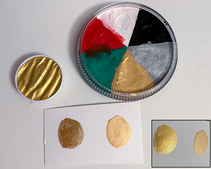
This is a comparison between my Coliro metallic watercolor pan and the gold color “Gold Star” in Santa Baby. The opacity of the Coliro is better and the metallic sheen is a beautiful almost mirrored glitter. “Gold Star” has gold metallic particles and flash, sure, but it’s very subtle. It could be used for very purposely subtle accents, I suppose.
I have to admit that the “Trim the Tree” green is beautiful and I’m glad to have it.
I’m also very glad to have the white because it layers very well over other LayerCake colors. It’s definitely more opaque than my white Posca pen and easier to use than tube white gouache.
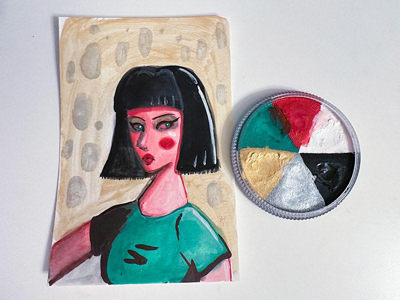
This is a quick painting I did on Mixed Media paper using only colors from the Santa Baby palette. I struggled a lot with the limited palette because the metallic colors are not at all opaque and I couldn’t figure out how to use them: I tried the silver as a wash on the shirt, which failed; I tried the gold and silver in the background, which is patchy; and I used a little gold as eyeshadow, which is subtle but good. I am also not inspired by a palette of the remaining colors of black, white, red and green. Still, I tried to do the exercise and it was probably a good thing.
If I had to do it all over again, I would probably not purchase the Colour Wheel Santa Baby palette, it’s just not for me. At minimum buying a white single instead would be mandatory, because I love the white a lot. I can imagine a future where if I do get another larger palette, or even just a white pan, I might put Santa Baby in a drawer forever or give it away.
Conclusion
The briefest conclusion possible is that I really, really like these paints! I love how I’m getting the ease of use of a palette of pan watercolors but I’m also getting the opacity and blendable nature of gouache. Though they’re quite expensive, I am already wishing I had more, particularly some blues.
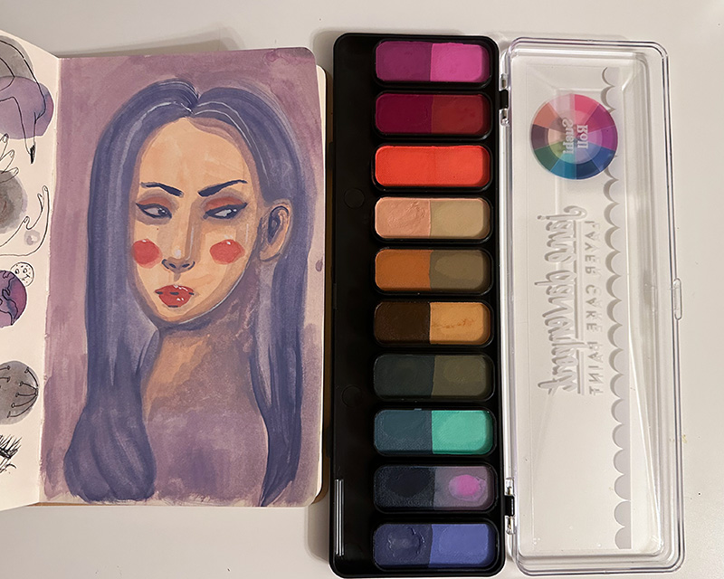
I did some swatching, I painted a few things, but this was only one day’s worth of experience with these paints.
What I’d really like to do is some side-by-side comparison with other media I own. I’d like to compare these to HIMI gouache, to Caran D’Ache Neocolor II crayon pastels, and to what I might get if I took regular Jane Davenport watercolors and simply added tube white gouache.
I’d also like to combine these with other media to see how they layer and what other quirks I might find out.
Do you have any questions you’d like answered? Let me know if so!
